As we prep the script and scores for revision and rehearsal it’s made me think a lot about READABILITY – the confluence of content and presentation. I’ve spent my life developing that confluence for live performance – but what about when I’m not there?? How do I work on readability for the people who need to engage with my work on paper?
READABILITY: The confluence of content & presentation Share on X
A quick look at the first stage: Stumble-Through
To start working on the show, the first thing we did was to simply stumble though the script, ‘we’ being Tim Maurice, the pianist I work with – and me. Tim was at the piano and I was reading the dialog and singing all the songs. We’ve got it down to a routine now in our weekly rehearsals. Here we’re talking about the best place to end a repeat in the music.
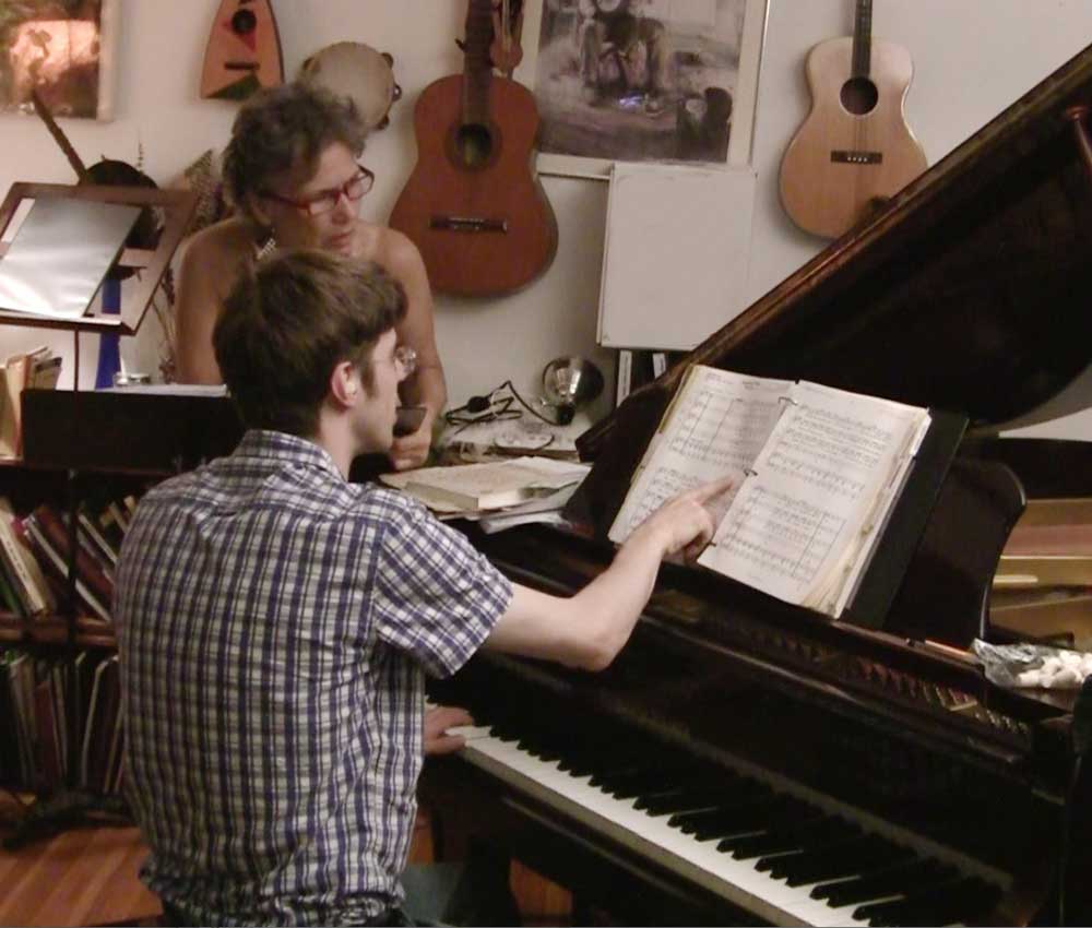
During the stumble-throughs, I scribbled notes about what I want to change dramatically and compositionally: where the music needs to repeat, where the dialog needs to integrate with the music differently — and Tim scribbled notes about music cues and what needs to change to make the manuscript more readable.
So, what makes something READABLE?
When I work with a team, or collaborate with other artists, I noticed that there’s often a lot of time spent simply working out how things need to be written. I, in particular, grapple with that all the time because I’m very visual. A pile of data on a page looks like spaghetti to me. I can’t ‘read’ it – it just stresses me out. It’s not until it has visual order that I can see it as information. I see that it’s ‘there’ when it’s jumbled (to me) data – but I can’t engage with it. I can’t do my creative or performance-related part of the work.
A pile of data on a page looks like spaghetti to me Share on X
This isn’t a problem I have with stories I’m reading for pleasure, but any information I have to work with needs to have visual meaning or it just doesn’t work for my brain. So I spend a lot of time reformatting written words (or asking other people to) – but I”m not so savvy about what makes music more readable. I don’t even read music the way classical musicians do – I read it from chord charts, not musical notes – so I can’t use my own intuition with this. So I write the musical notes the best I can and then always ask a real ‘reader’ to help me improve the readability.
It’s the same with the script. I can see it all in my mind, but to make it clear to the script coach, or anyone reading it – I have to put those visualizations in writing: add stage directions, make sure I share my vision in a way that other members of the creative team can take the work to the next level with THEIR expertise.
So, what IS readability?
For a computer it’s not a big deal. I just play what sounds good to me, the music-writing program translates it into notes on the page and my computer plays it back ‘perfectly.’
But my computer’s not reading music – it’s just deciphering and playing back the notes. For HUMAN READERS, the WAY it looks on the page either helps or hinders because they’re looking for meaning, not just notes. The way it’s written shows Tim the flow of the music, the harmonic meaning of each chord cluster, even how the music is related to the story.
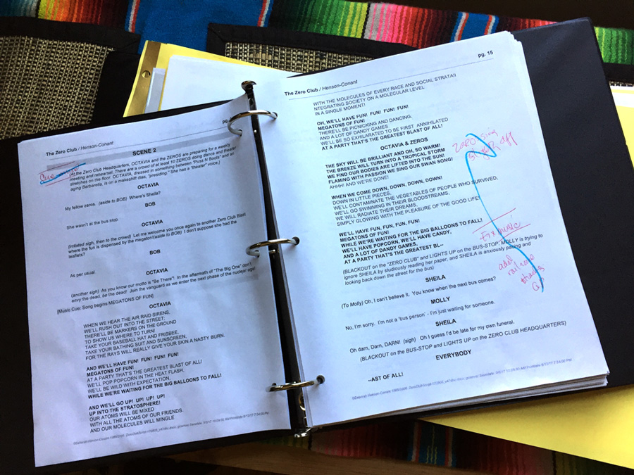
So while I’m editing the script and the story, Tim’s editing how the music LOOKS. For my part, I use a system where I identify the things I want to change in red, and then ‘blue them out’ when I update them in the script, like this;
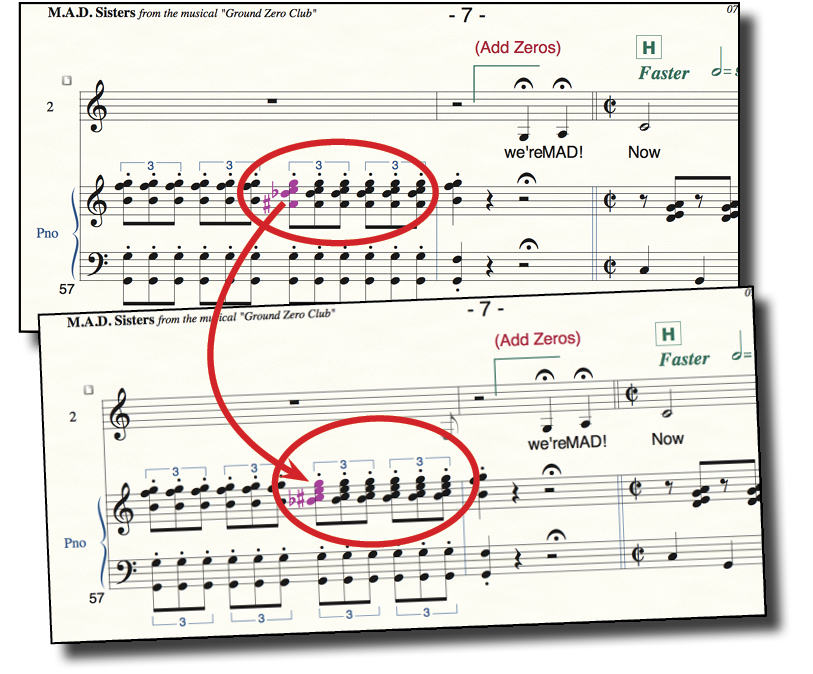
 I asked Tim to make some screen-shots of what he changes so I could share them with you as well. In this first example, he’s changed this chord so it’s easier to read. Both these examples will ‘sound’ the same — they’re the same notes on the piano, the bottom one is easier for a musician to read within the context of the rest of the music. I think – if I were to try to take this kind of editing out of the technical language of music — that he’s working to clarify what changes, what the movement is and how these notes or chords relate to the context (the key signature)
In this second example, you can see that he changed two different chords in a sequence, so the flow or the shapes are easier for him to follow. That’s part of what lets him read the music more easily instead of just deciphering notes. Again, all three examples sound the same, the bottom is just more readable.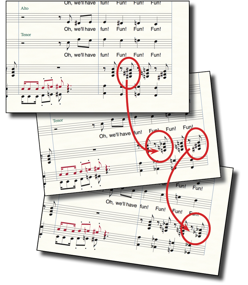
I know this is probably really geeky stuff, but this kind of thing fascinates me. It makes me think about the general idea of readability. What is readability in general and what is it specifically for each person, each instrument, each type of mind?
How about YOU?
What needs to be more readable in YOUR life? What would make it more readable? And heck, while we’re at it … what made this post more readable … or less readable to you?



For a Church Choir Singer who sings to make “a Joyous NOISE” I appreciate readability because I never did Theory in High School and I do my best to stay up with the Music Majors and folk who can still play an instrument.
What a fascinating topic you explore, Deborah! After reading this, I realized that what makes something readable for me is when I can pick up keywords and/or get the atmosphere, overall message, or a feel of what is being presented or expressed. It was also very helpful to see the “skeleton” for “Baroque Flamenco” in your current online course and seeing it visually makes it so readable for me in that sense – to experience the shape, structure, and feeling of the piece.
Don’t tweet, so responding to readability question here. First let me say, my curiosity and fascination with what you were writing about and the way you were expressing it kept me reading to the end of section. What made it less readable for me was that I had to keep going back to the examples to see what which one I preferred (nothing wrong with that, just time-consuming) and to see what I must have missed, because in discussing the first example of chord editing, you comment “Again, all three examples sound the same,…readable” when I could only find two. I did find all three in the second example set.